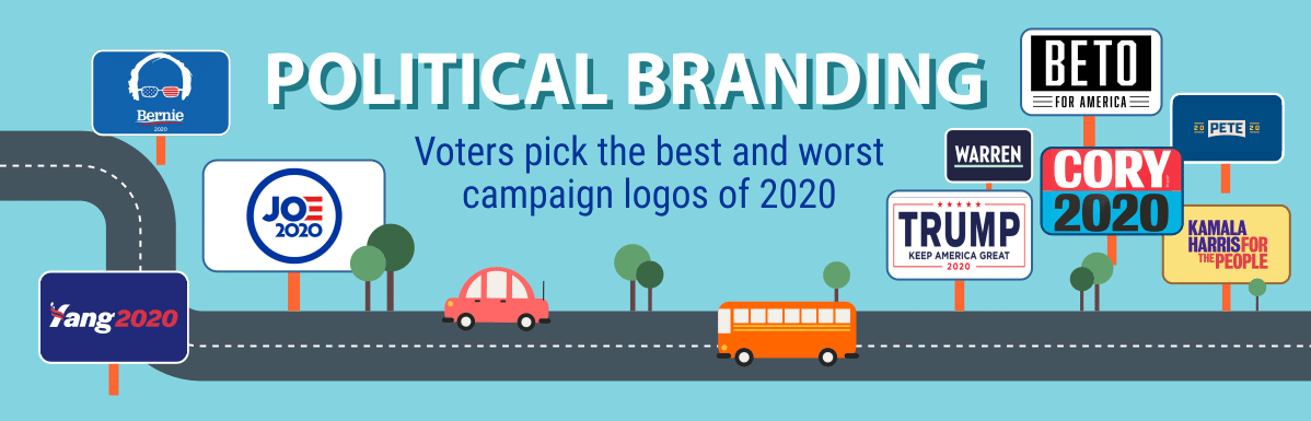
Political Branding
Voters pick the best and worst campaign logos of 2020
If you aren’t familiar with the 2020 presidential candidates’ logos and slogans yet, don’t worry: You will be soon enough. The two dozen hopefuls looking to replace President Trump have been raising money and hiring strategists to help them stand out in the crowded race. A good chunk of that money is set aside for branding and marketing.
The field is still in a state of flux, with a few pragmatic Democrats already ending doomed bids while a handful of coy Republicans and independents continue to drop hints about entering the race. However, the most likely contenders all have released logos and slogans that reflect the ideals of their campaigns.
As the clock ticks toward primary election season, these logos will begin springing up on bumper stickers and roadside signs like mushrooms after a spring rain. Social media feeds will swell with sponsored ads in the candidates’ carefully chosen color palettes and fonts. Every election-related news story will feature aspiring nominees speaking at branded podiums to crowds waving branded placards.
Political branding is nothing new. But there are a few features that stand out in this election cycle:
- The field is one of the most crowded and most diverse ever, putting more pressure on candidates to differentiate themselves through branding.
- More candidates are abandoning familiar patriotic color schemes and flag-inspired imagery.
- Digital communication is more important than ever. Candidates are reaching out to voters via an enormous array of platforms and devices.
- Nearly half the hopefuls have put themselves on a first-name basis with the American public.
- The costs are staggering. This election will likely shatter spending records.
To find out how the Class of 2020’s branding resonates with the public, we partnered with an independent research firm to survey 1,258 registered voters across the country and score the campaign materials. In every question and set of instructions, respondents were urged to focus on the graphic design or slogan, not the candidate.
Read on to see what we learned.
Slideshow: Funniest Voters’ Comments on the 2020 Candidate Logos
See more comments here.
Campaign Logo Hits, Misses, and Outright Messes
Good marketing doesn’t necessarily win elections, but it can definitely help. Voters were asked to score each logo on a scale of 1 to 10, setting aside their personal feelings about the candidates and judging solely on the effectiveness of their logos. The voters weren’t universally wowed by any of the designs — none achieved an average score of 8 or higher. But there were logos that generally appealed to both Democrats and Republicans, plus some that clearly missed the mark all around.
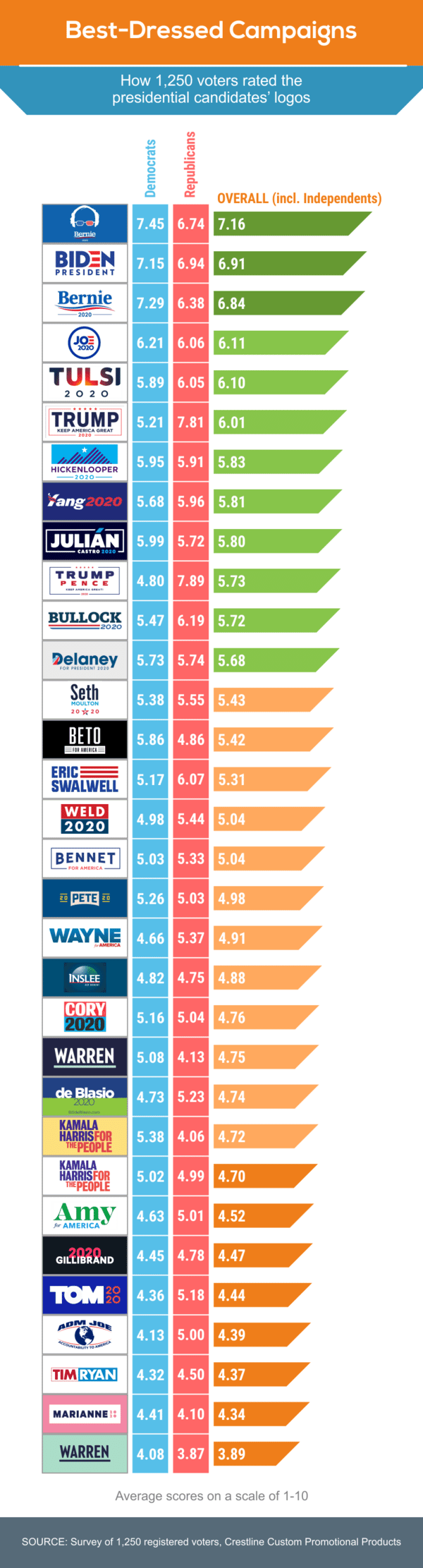
This year’s election cycle is seeing greater diversity just about everywhere, from the candidates’ resumés and personal backgrounds to the styles and approaches of their branding. Voters are responding favorably to some of this distinctiveness, but not all. Democratic front runners Bernie Sanders and Joe Biden lead the pack in logo favorability — although the other Dem favorite, Elizabeth Warren, has the hands-down least popular wordmark.
Sanders’ clever “glasses logo” topped the list of voter favorites, and his more conservative “swoosh” logo landed in third place. Biden’s logos traded off the other top spots at second and fourth place. They shared the top five with a surprise showing from Tulsi Gabbard’s unusual “sunrise gradient” logo, which beat out the Donald Trump solo logo, in sixth place.
THE POWER IN A NAME
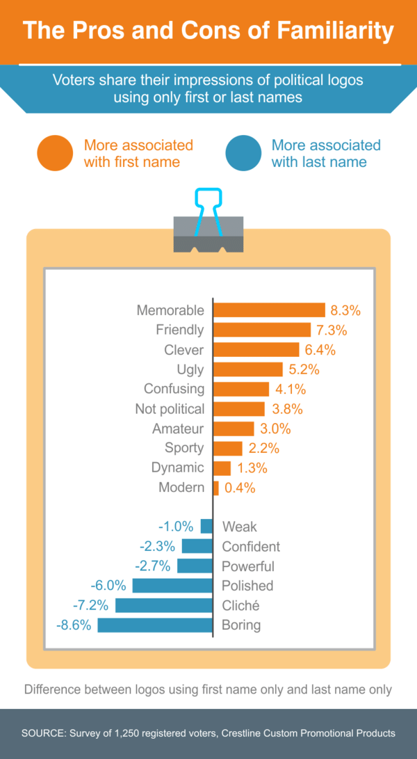
One burgeoning trend is first-name-only branding, which the campaign trail is seeing more of this year than ever before. Among the 27 included in this survey, 11 candidates used only their first names in their logos, compared to 12 who used only their last names, and 5 who used both names. Reactions to first-name logos from voters ran the gamut from “friendly” and “accessible” to “overly familiar” and “arrogant.” Voters felt last-name logos were mostly “confident” and “polished” (although the word “boring” also placed high among the descriptions). In general:
- Republicans are more likely to prefer last names; Democrats prefer first names.
- While younger people are more accepting of first-name-only candidate logos, only voters in their 30s actually prefer first-name over last-name logos.
- Many women are turned off by candidates getting too familiar, too fast. Women have a slight preference for last-name logos over first-name ones; men have the opposite preference.
COLORING OUTSIDE THE LINES
Many survey takers found the growing use of non-traditional colors refreshing (5.05 on a scale of 1-10), but most voters still seem to favor the traditional patriotic palette (5.40). Except Gabbard’s, all the logos in the top five spots — and 14 among the top 20 — flew the red-white-and-blue, although not all in a traditional way.
Still, 12 of the 27 candidates took the risk of living in color, distancing themselves from party affiliations while distinguishing their individual identities. Kamala Harris’ gold-red-and-purple logo was inspired by Shirley Chisholm’s campaign in 1972, and John Hickenlooper’s pays homage to the purple mountains’ majesty of his home state, Colorado. In a surprising result, the survey found that male voters tend to be slightly more receptive (4.92 out of 10) to logos with non-traditional colors than females (4.97).
The Best and Worst Campaign Slogans of 2020
American presidential campaigns have yielded some truly iconic political slogans. Some inspired hope, like Franklin Delano Roosevelt’s promise in 1932 that “Happy Days Are Here Again” or Barack Obama’s offer in 2008 of “Change We Can Believe In.” Others were simple and catchy, like Dwight Eisenhower’s “We Like Ike” in 1952 or Lyndon Johnson’s “All the Way With LBJ” in 1964.
Slogans summarize the essence of a campaign in a single phrase. The best ones are usually memorable, concise, and connect to voter concerns. The current election cycle has yielded more than two dozen campaign slogans, but based on voter reviews, none are likely to land in the history books. The highest scorer came in at 6.6 out of 10.
Here’s how the 2020 presidential hopefuls’ slogans fared in our survey.
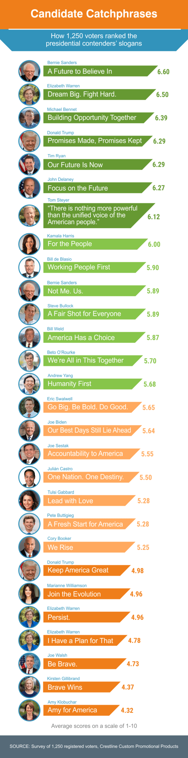
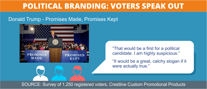
Based on the feedback of 1,258 registered voters, the future is a winning theme in the coming election cycle — but bravery is not. Three of the top six slogans specifically use the word “future,” in direct contrast to President Trump’s vision of preserving America’s past greatness. Donald Trump’s secondary slogan “Promises Made, Promises Kept,” did much better with survey takers than his primary message: “Keep America Great.”
LOOKING FORWARD
The highest-scoring slogan was Bernie Sanders’ “A Future to Believe In.” Survey respondents called it “simple” and fairly “cliché” but also “hopeful,” “optimistic,” and “inspiring.” Tim Ryan’s and John Delaney’s catchphrases elicited similar feedback.
In second place, Elizabeth Warren got praise for her message: “Dream Big. Fight Hard.” Survey respondents said it was a “feel-good message” that also brought to mind the plight of young people brought to the U.S. illegally as children, known as “dreamers.” Longshot candidate Michael Bennet nabbed the third-highest score with his slogan “Building Opportunity Together” — another hopeful and forward-looking theme.
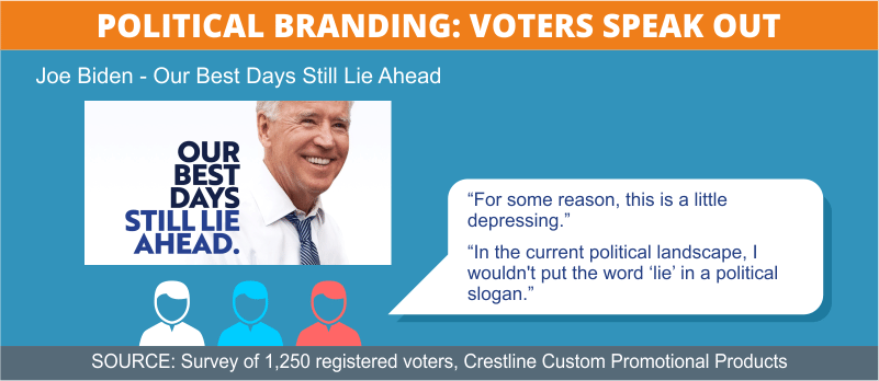
Frontrunner Joe Biden was not as successful in his attempt to paint a rosy picture of the future. Voters said his 16th-place slogan “Our Best Days Still Lie Ahead” managed to be both optimistic and somehow “gloomy” and “a little depressing” at the same time.
Also struggling to make the theme work, Pete Buttigieg landed in 20th place with “A Fresh Start for America.” Although the idea had some appeal, many survey respondents weren’t buying it. “Seems naive. The next president will inherit a huge mess, not a clean slate. This candidate doesn’t seem prepared for that,” remarked a 51-year-old Democratic man from Oregon. “America doesn’t need a fresh start; we need to deal with the problems brought on by the current administration and turn the ship around,” said a 44-year-old female Independent voter from Georgia.
BRAVERY
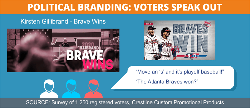
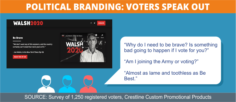
At the bottom of the pack, the two slogans that used the word “brave” were panned by survey respondents. Joe Walsh’s “Be Brave” message was likened to Melania Trump’s less-than-well-received “Be Best” campaign. Voters asked, “Am I joining the army, or voting?” and “Why do I need to be brave? Is something bad going to happen if I vote for you?”
Respondents were also baffled by now-withdrawn Kirsten Gillibrand’s “Brave Wins” message. “What does that even mean? The Atlanta Braves won? This makes no sense as a political slogan,” remarked a 46-year-old male Independent voter from New Mexico.
WHO’S FIRST?
In ninth and 14th places respectively, Bill de Blasio and Andrew Yang both included the word “first” in their slogans, and the survey takers weren’t impressed. The New York mayor’s “Working People First” slogan offended several voters, like a 31-year-old Democratic woman from New York who asked: “Isn’t that marginalizing anyone who can’t work?” and “What about the young, the elderly, and the disabled? Don’t they count?” Another critic, a 48-year-old Independent woman from Indiana, said, “All people need to feel that they are represented by a candidate, not just those with employment.”
Regarding Yang’s “Humanity First” slogan, voters responded with a resounding, “As opposed to what?” A 37-year-old Republican woman from Nevada asked, “What does that really mean? Humanity First sounds like a response to ‘America First,’ but it’s really vague.”
TOGETHERNESS
Several candidates focused on unity and inclusiveness in their slogans. Billionaire outsider Tom Steyer earned a respectable seventh place with his lengthy slogan: “There is nothing more powerful than the unified voice of the American people.” Voters called it “wordy” and “way too long,” and said, “That’s not a slogan, it’s more like an essay!” Nonetheless, the message also was described as “compelling,” “sincere,” and “positive.”
Also generally well-received, Kamala Harris ranked eighth with her courtroom-inspired “For the People” tagline. Bernie Sanders’ alternate slogan just cracked the top 10 with his other slogan “Not Me. Us.” Both messages elicited approval for the candidates’ putting others before themselves.
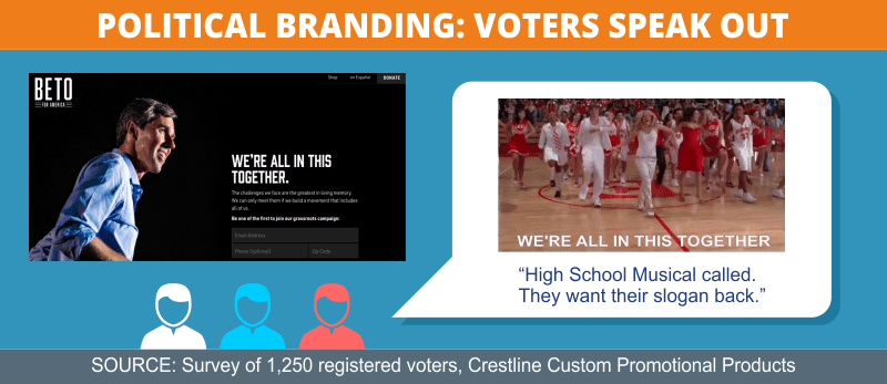
But other messages with this theme didn’t fare as well. Beto O’Rourke was mocked by many survey takers for his “We’re All in This Together” slogan, which anyone younger than 30 (and most of their parents) will recognize as the title of a song from a Disney movie. “High School Musical called, they want their slogan back,” wrote a 26-year-old Republican man from California.
Cory Booker was also dinged for his “We Rise” slogan, which confused many survey respondents. “Most of us who are still alive rise at some point during the day,” noted a 64-year-old Democratic man from Texas. “Huh? We rise? Who rises? When do we rise? Sunrise? This is too simple and open-ended,” said a 30-year-old Democratic woman from Louisiana.
UNFORTUNATE WORD CHOICES
Several candidates drew criticism for particular words they used. A few voters questioned whether Joe Biden’s use of the word “lie” was wise. “In the current political landscape, I wouldn't put the word ‘lie’ in a political slogan,” cautioned a 39-year-old Democratic woman from Virginia.
Steve Bullock might have been channeling the popular musical “Hamilton” and not wanting to throw away his chances with the slogan “A Fair Shot for Everyone.” But the word “shot” didn’t go over well. “Probably not the right climate in America to have gun references in your slogan,” wrote a 59-year-old Democratic woman from Arizona.
Joe Sestak was onto something with his vision of bringing honor and integrity back to public office, but his slogan “Accountability to America” was a turnoff for many voters. “Nice idea, but ‘accountability’ reminds me of an accountant and money. It’s a pretty dry, unexciting slogan,” wrote a 44-year-old Republican woman from Washington.
The First-Name Game
Joe, Bernie, Pete, Beto, Amy, Cory, Tulsi, Marianne, Tom, Wayne, and another Joe. It’s not the cast of a new sitcom; it’s a list of the political candidates who have chosen to use only their first names in campaign materials. A whopping 11 presidential hopefuls have gambled on the informal, first-name approach. To find out how that’s going over with voters, we crunched the data.
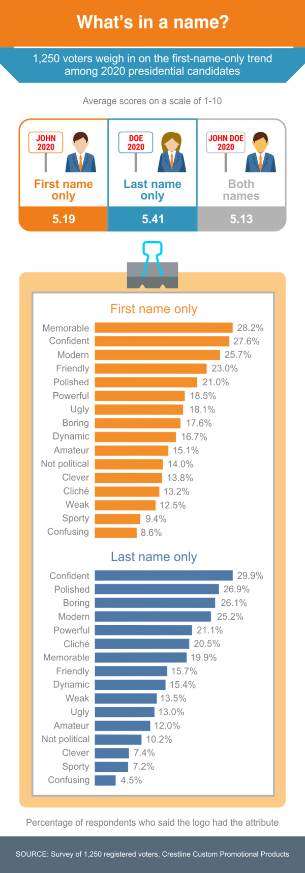
In an effort to stand out from this year’s crowded field, a greater share of candidates than ever before — about 39% — are using only their first names on their logos. Some analysts say this influx was fueled by Bernie Sanders’ 2016 campaign logo, which conveyed an informal, friendly message of accessibility. A slightly larger percentage (42%) of candidates stuck with the traditional last-name-only logo, and five of them (19%) used both their first and last names.
11 candidates used their first name only:- Amy (Klobuchar)
- Bernie (Sanders)
- Beto (O’Rourke)
- Cory (Booker)
- Joe (Biden) - 2nd logo
- Joe (Sestak)
- Marianne (Williamson)
- Pete (Buttigieg)
- Tom (Steyer)
- Tulsi (Gabbard)
- Wayne (Messam)
- (Michael) Bennet
- (Joe) Biden - 1st logo
- (Steve) Bullock
- (Bill) de Blasio
- (John) Delaney
- (Kirsten) Gillibrand
- (John) Hickenlooper
- (Jay) Inslee
- (Donald) Trump
- (Elizabeth) Warren
- (Bill) Weld
- (Andrew) Yang
- Julián Castro
- Kamala Harris
- Seth Moulton
- Tim Ryan
- Eric Swalwell
For candidates with first-name recognition, like Beto and Tulsi, the first-name-only approach could work, but it may be less useful for, say, Pete or Amy. With surnames like Buttigieg and Klobuchar, they could be forgiven for taking the first-name gamble — but it’s one that largely did not pay off with survey takers.
Although voters rated the first-name logos overall as mostly “memorable,” “modern,” and “friendly,” they also ranked them high in the “ugly,” “boring” and “amateur” categories. Last-name logos were deemed largely “confident,” “powerful,” and “polished,” but also “boring” and “cliché.”
Naming conventions broke down among party lines. The first-name gambit seems to be paying off among Democratic voters, who gave logos featuring only first names higher scores than those using just surnames, 5.42 to 5.24. Republicans preferred the more traditional last-name approach 5.74 to 5.40.
Women were more likely to be turned off by excessive familiarity than men. Although the margins were narrow, women scored logos featuring last names more highly at 5.47 than the chummy, first-name versions at 5.41. Men scored the first-name logos a tad higher at 5.42 than those highlighting candidates’ last names at 5.39.
Generally, younger voters are more open to first-name candidate logos than their senior counterparts, but the only group that actually preferred first names to last names were people in their 30s.
Racing Around the Color Wheel
Liberty green, muted gold, hot pink, majestic purple, a sky’s worth of blues, and even a gradient here and there: No, it’s not your daughter’s dorm room. It’s a campaign palette containing a wider spectrum of logo colors than any previous presidential race has seen. According to some experts, this year’s trend moves away from the traditional red or blue that signals a party affiliation, expanding instead into a rainbow of colors to help each candidate define their distinct identity. We asked survey respondents how the color choices sat with them.
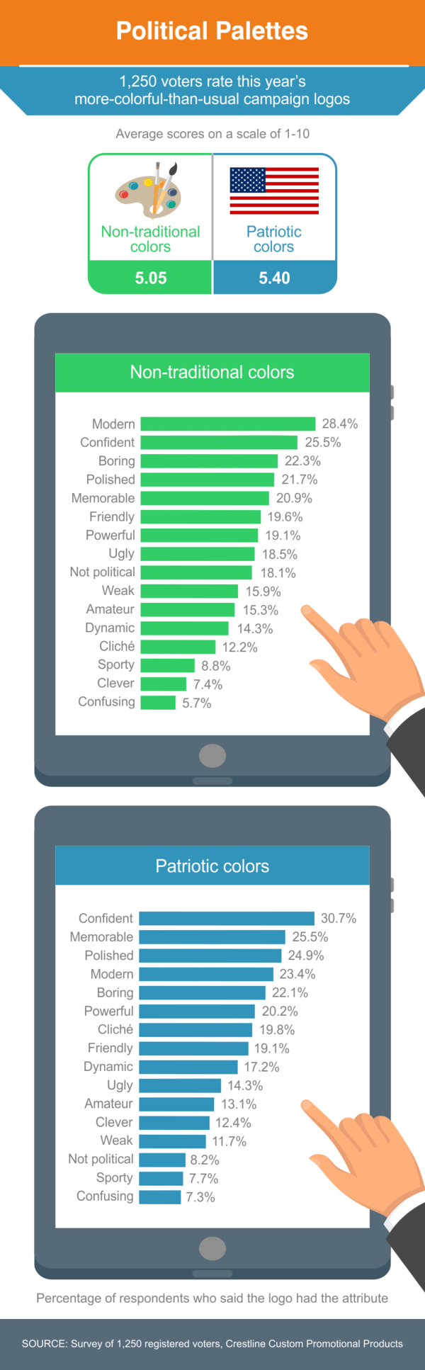
Of the 27 candidates, 15 used some variation of the traditional red-white-and-blue color scheme (although even those boundaries were pushed, with some blues veering from greenish to grayish and some reds straying into orange territory). The remaining 12 candidate logos essentially covered the spectrum, implementing non-traditional color combos that reached from blue/green through purple/red/gold all the way to black/white, evoking a range of ideas and connotations — as well as skepticism.
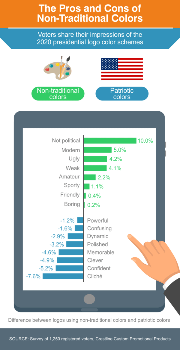
The response to this colorful trend was clear: Survey takers did not taste the rainbow. They overwhelmingly described logos with non-traditional colors as “not political.” And although they followed up with “modern,” there were also descriptions of “ugly,” “weak,” and “amateur.”
Democrats are more receptive to non-traditional colors than Republicans, giving them an average score of 5.11 vs. GOP voters’ 4.91. But both groups preferred red, white, and blue. Dems gave logos in traditional hues an average of 5.45 while Republicans gave them an average of 5.93.
Candidates hoping to appeal to women with pinks and pastels might be missing the mark. Men were more open to creative color palettes than women (by 4.97 to 4.92). However, both genders preferred red, white, and blue. Men gave patriotic-colored logos an average score of 5.44, while women rated them 5.64.
Using purples and greens isn’t necessarily a fast track to the youth vote, either. Although younger people were slightly more open to alternative palettes, every age group scored patriotic-colored logos higher. Voters in their teens and twenties gave logos with non-traditional colors the highest average score (5.14), but they still preferred red, white, and blue (5.57). Voters in their 60s and 70s gave non-traditional logos an average of 4.68, while they gave flag-colored logos an average score of 5.58.
You Never Get a Second Chance to Make a First Impression
If you dig out your high school yearbook, chances are you’ll find a “Senior Superlatives” section recognizing noteworthy students — from Most Likely to Succeed and Best Smile to Most Likely to Change the World. Along those lines, we asked voters to rank the political Class of 2020’s logos using a list of words with meanings both good and bad. Voters ticked off the qualities they felt each logo exhibited. And they had definite opinions about who the standouts were, and why.
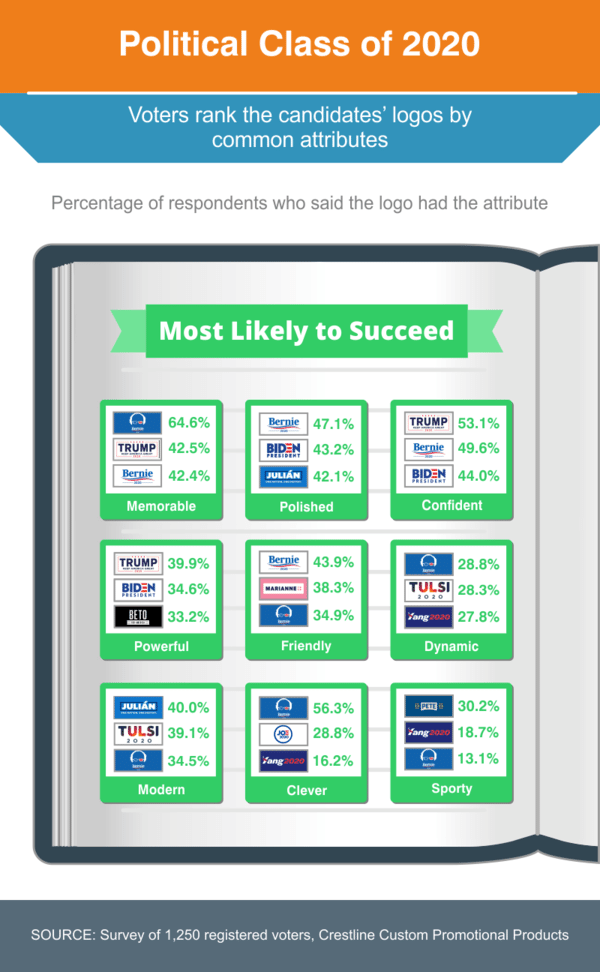
The best-received logo overall made creative use of Bernie Sanders’ uncool attributes — a silhouette of his unkempt hair, and glasses adorned by the stars and stripes. Survey takers voted Bernie’s logo Most Likely to Succeed with an overall score of 7.16 out of 10. It also ranked first for qualities like “memorable,” “dynamic,” and “clever.” Sanders and Biden shared the top five spots with Tulsi Gabbard, who ranked high in “modern” and “dynamic” categories and finished just above Trump’s solo logo. (The president did not win for Best Hair, alas.)
The top rankings for positive qualities were dominated by logos for front-runners Biden, Sanders, and Trump, exhibiting “memorable,” “polished,” “confident,” and “powerful” qualities (also highly associated with the traditional red-white-and-blue color palette they all used). But a few wild cards sneaked into top spots for other categories, such as Yang, who ranked high for “dynamic,” “clever,” and “sporty” qualities, and Castro, whose logo was in the top 3 for “polished” and “modern” qualities. Williamson’s pink logo ranked among the most “friendly,” and O’Rourke’s stark black-and-white logo placed third in the “powerful” category.
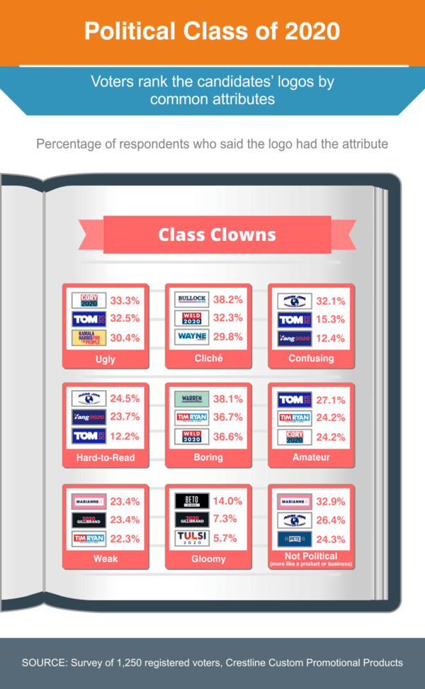
Among the rankings for negative qualities, Booker’s comic book-esque logo won the “ugly” category, Warren’s navy blue logo won for “boring,” and O’Rourke’s branding was deemed most “gloomy.” Sestak, Steyer and Yang’s logos wrapped up the top spots in the “confusing” and “hard to read” categories. Williamson, Sestak, and Buttigieg took the top three spots for logos that seem “not political (more like a product or business).”
Voters’ comments about logos
Democratic Candidates
Republican Candidates
Withdrawn Candidates
- Democratic Candidates
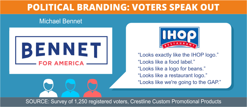
- Candidate: Michael Bennet
- Title: U.S. Senator from Colorado since 2009
- Declared Candidacy: May 2, 2019
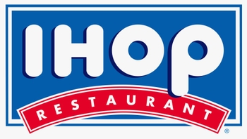
Bennet’s safe and simple logo, using Source Sans font, ranked in the middle of the pack with a score of 5.04 out of 10. Survey respondents used words like “basic,” “boring,” and “cliché” to describe it. Several found the “for America” superfluous, responding, “Who isn’t for America?” Many also said it reminded them of the old IHOP logo.
Other comments:
“It looks like a food label.”
“It looks like a logo for beans.”
“This looks like a restaurant logo.”
“It's like we're going to the GAP.”
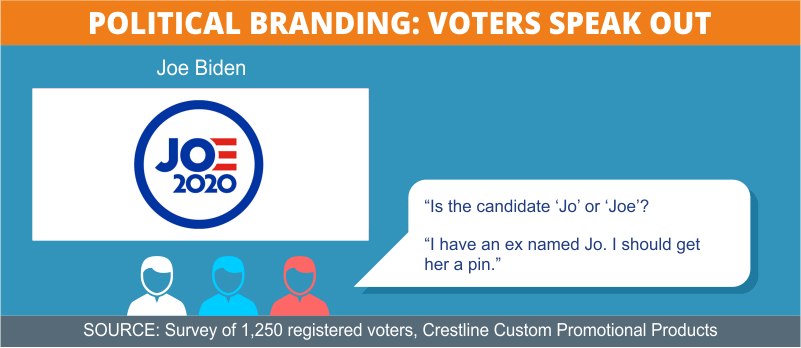
- Candidate: Joe Biden
- Title: Former Vice President, 2009-2017, and U.S. Senator from Delaware, 1973-2009
- Declared Candidacy: April 25, 2019

Rather than commit to using just his last name or just his first name, front-runner Joe Biden released separate logos featuring one of each. The logos, using the font Brother 1816, were the work of Blue State Digital.
The horizontal version featuring his last name was the voters’ second-favorite logo, scoring 6.91 out of 10. Survey respondents said it looked “American,” “patriotic,” “presidential,” “bold,” and “modern-looking.” However, some felt the omission of the word “for” smacked of entitlement and overconfidence. “I'm not sure why ‘for’ is omitted from the logo. I think it can rub people the wrong way because Biden is not yet a president.”
Other comments:
“Nifty use of the ‘E’ in Biden being those three red lines.”
“It looks like a logo for beans.”
“I like the idea that it sort of states that Biden is a ‘bid’ for office. Clever.”
“This one is professional, like he's been in it for a while.”
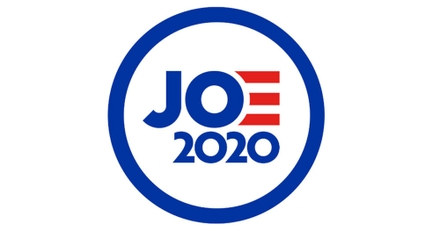
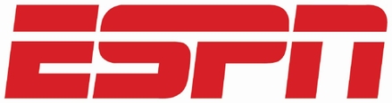
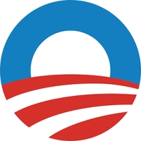
The round “Joe 2020” version ranked a bit lower, coming in at fourth place with a score of 6.11 out of 10. Survey respondents said it was “eye-catching,” “clever,” “polished,” and gave a “sense of motion.” However, some felt that with so many candidates in the race (including Joe Sestak and Joe Walsh), it was too common a name to stand alone. Several noted the similarity to President Obama’s iconic ‘O’ logo. A couple also said it reminded them of ESPN’s trademark.
Other comments:
“I like the play on the flag.”
“The ‘OE’ looks more like the Ohio flag than the US flag.”
“Wait, who is this for? Joe Biden?”
“Is the candidate ‘Jo’ or ‘Joe’?”
“Not sure if I would have gone with the striped ‘E’ on this. I have an ex named Jo. I should get her a pin.”
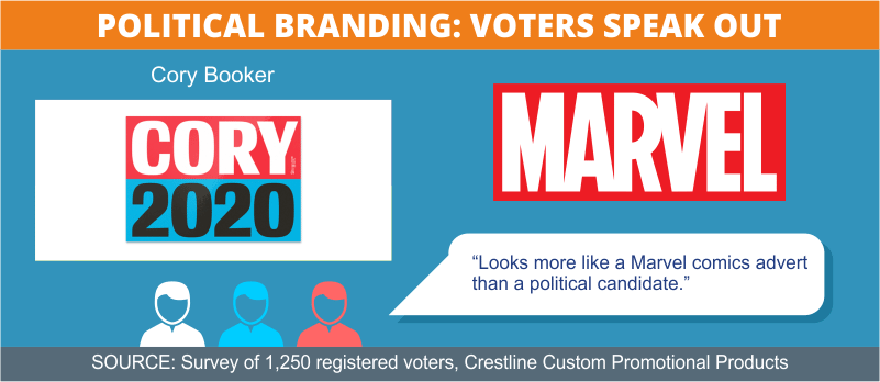
- Candidate: Cory Booker
- Title: U.S. Senator from New Jersey since 2013
- Declared Candidacy: February 1, 2019

Cory Booker jumped on the first-name train with this simple, blocky, colorful design that ranked in the pack’s bottom third with an overall score of 4.76 out of 10. Many respondents were confused by the color choices, which elicited descriptions of “weird” and “jarring.” The Conductor font, which several described as “cartoonish” or “comic book-ish,” more than once drew comparisons to Marvel Comics’ logo.
Other comments:
“The blue is a strange shade — not at all like ‘American’ blue.”
“I'm seeing comic book themes in this one.”
“Pow! Cory 2020! I like the balance — 4 characters on each side. The opposing colors imply that Booker's got it covered for everyone (black/white, red/blue).”
“Looks a bit like the NPR logo.”
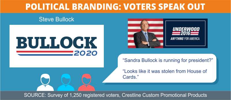
- Candidate: Steve Bullock
- Title: Governor of Montana since 2012
- Declared Candidacy: May 14, 2019
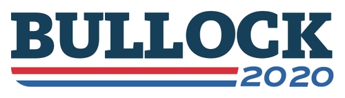
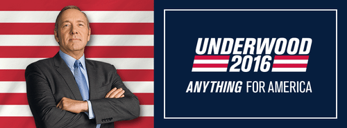
Steve Bullock’s classic logo, using the font FF Kievit Slab, rounded out the top third of the pack with a score of 5.72 out of 10. Responses — whether positive or negative — largely seemed to land in a safe middle range of descriptors: “decent,” “clean,” “familiar,” “serviceable,” “basic,” “standard,” and “entirely average.” It also drew comparison with Frank Underwood’s campaign logo from the TV show House of Cards.
Other comments:
“Sandra Bullock is running for president?”
“This logo is a bit cliché and uninspired.”
“I like how this image screams ‘America.”
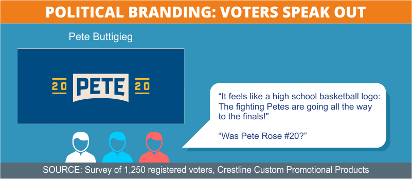
- Candidate: Pete Buttigieg
- Title: Mayor of South Bend, Indiana, since 2011
- Declared Candidacy: January 23, 2019
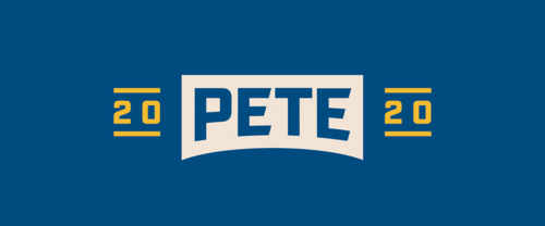
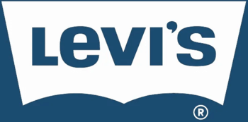
Mayor Pete’s blue-and-gold logo landed in the middle of the pack with a 4.98 out of 10 score for its Aktiv Grotesk font and design by Brooklyn design firm HyperAkt. Several respondents said it reminded them of high school or college sports team apparel. “It's actually kinda good. It feels like a high school basketball logo: ‘The fighting Petes are going all the way to the finals!’ ” remarked a 44-year-old male Democrat from Michigan. The collegiate feel drew mixed reviews, with some questioning whether it was a wise move for the youngest candidate in the race (who graduated in 2007). Still others referenced blue jeans logos like Wranglers or Levi’s.
Other comments:
“Looks like it belongs on a beer bottle.”
“This one is confusing because you don’t know if is political, sports, or a product.”
“It feels like it's a logo of a classy restaurant.”
“Was Pete Rose #20?”
- Candidate: Julián Castro
- Title: U.S. Secretary of Housing and Urban Development, 2014-2017
- Declared Candidacy: January 12, 2019
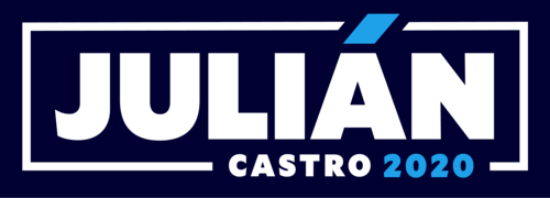
The logo for Julián Castro uses the Mallory Black font and earned an overall score of 5.80 out of 10, ranking it just inside the Top 10. Several survey respondents remarked on the accent over the ‘A,’ which they imagined was to help emphasize his Latino heritage. Many others had opinions on the colors; some called them “attractive” and “memorable” while others disliked the shade of blue or felt the design lacked the requisite red for a presidential campaign logo.
Other comments:
“The blue is the wrong shade for this country.”
“Looks nice but still wouldn't stick in my head.”
“The accent mark makes it seem like it's Juli An!”
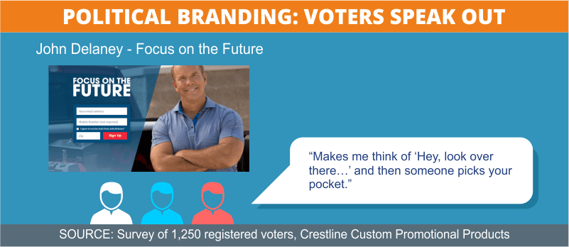
- Candidate: John Delaney
- Title: Former U.S. Representative from Maryland, 2012-2016
- Declared Candidacy: July 28, 2017
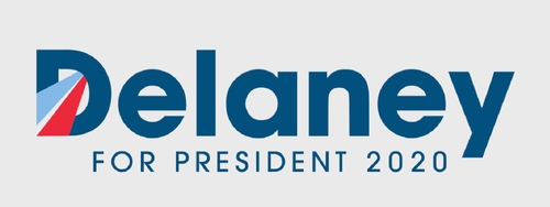
The first Democrat to announce a 2020 campaign, Delaney is running with a logo that uses the Avant Garde font of Rally Campaigns. The design earned him a middling spot with an overall score of 5.68 out of 10. Largely lukewarm responses included “good,” “clean,” “generic,” “professional,” “average” and “cookie-cutter.” Some compared it to an airline logo. Many focused on the red and blue stripes in the ‘D,’ some interpreting them as forming a road, and others remarking on their similarity to the iconic ‘O’ in Obama’s logo.
Other comments:
“This looks like a class president ad for a high school to me.”
“I like the ‘inference’ of a highway (or road) for all people to travel.”
“The red and blue of the first letter is reminiscent of a highway indicating moving forward. It specifies what the race is for, but still has too much blank space.”
- Candidate: Tulsi Gabbard
- Title: U.S. Representative from Hawaii since 2012
- Declared Candidacy: January 11, 2019
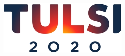
The Harmonia Sans font and color gradient in Tulsi Gabbard’s logo were the subject of many comments from survey respondents. While the consensus was that the design distinguishes it and makes it memorable, opinions diverged on whether the overall effect was good, bad, or just confusing. “The letter color fusing seems to say, ‘I don't know who I am,’ ” remarked a 49-year-old female Independent voter from Georgia. Several also said the logo reminded them of a travel poster. Regardless, the logo ranked at #5 with an overall score of 6.1 out of 10.
Other comments:
“It's kind of mysterious and makes me want to learn more.”
“I don't know if it's supposed to be a sunset or sunrise; those have very different connotations.”
“Something really irritating about the color gradation here, but I'm wondering if it's supposed to be referencing a sun, like dawn of a new day? Is this actually a play on visuals? That's kind of neat, now that I'm thinking on it. Just bumped it up from 4 to 7.”
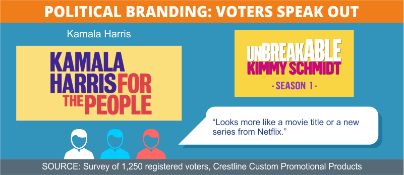
- Candidate: Kamala Harris
- Title: U.S. Senator from California since 2016
- Declared Candidacy: January 21, 2019
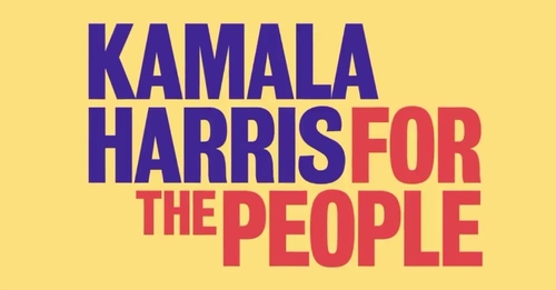
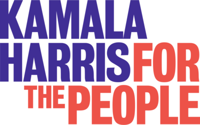
Harris presented two logos using the Bureau Grot font styled by Wide Eye Creative: one version with a yellow background, one on white. Both ranked consecutively near the bottom with scores of 4.72 and 4.7 out of 10, and each version generated more than 70 comments, many of them reflecting confusion. “Interesting, non-standard look. If I didn't already know her, though, I might think that was the title of a stand-up special or something,” said a 35-year-old male Independent voter from North Carolina. Many respondents said the logos look like branding for a TV show, Broadway play, or book cover.
Other comments:
“I don't like the color palette for this one and it looks cluttered.”
“It's bold and it has a cool 1970's action movie poster vibe going on with the message and the font. I like how her name and ‘people’ are the same size.”
“It's vaguely reminiscent of Soviet-era Russia… I have no idea why.”
Create Your Winning Branding Strategy with Promotional Products
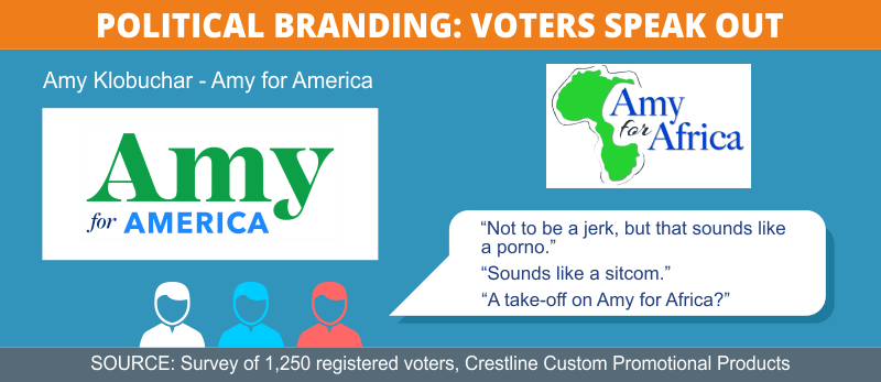
- Candidate: Amy Klobuchar
- Title: U.S. Senator from Minnesota since 2006
- Declared Candidacy: February 10, 2019
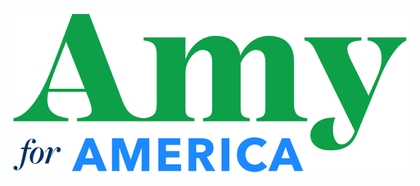
Designed by GPS Impact, the green Mackay font of Klobuchar’s first-name logo did not sit well with respondents, especially when mixed with two other colors and fonts. Her logo ranked near the bottom with a 4.52 score out of 10. Many commenters felt that it looks amateurish, while others said that first-name campaigns are for those with name recognition. Though a few found the greens and blues refreshing, most others found them inappropriate for a U.S. political campaign — and some compared the logo to a cookbook cover or plant nursery logo.
Other comments:
“Shouldn't all the candidates be for America?”
“Three different fonts, three different colors ... and green, when she's not the Green Party candidate? Nope.”
“I like the colors and how it is simple yet memorable.”
“It looks more a sign for a teenager running for student council.”
- Candidate: Wayne Messam
- Title: Mayor of Miramar, Florida since 2015
- Declared Candidacy: March 13, 2019

Messam’s logo drew descriptions of “straightforward,” “bold,” and “classic” — as well as “meh,” “safe,” and “OK” — landing it in the middle with a score of 4.91 out of 10. Some respondents had a problem with the disparate size of Messam’s name looming over “America.” The largest contingent of commenters noted that the colors and familiar Montserrat font bear a strong resemblance to the former logo of a certain corporate giant: “Reminds me of Walmart — so it’s Americana.”
Other comments:
“Makes me think of Batman, for some reason.”
“Doesn't make me want to learn more about him.”
“I thought John Wayne was dead? And isn't everyone from America?”
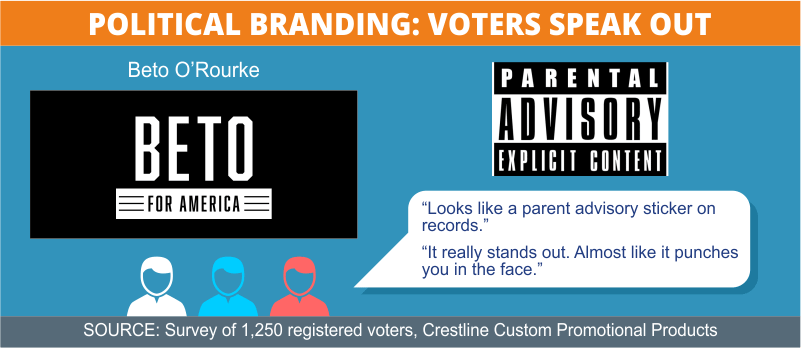
- Candidate: Beto O'Rourke
- Title: Former U.S. Representative from Texas, 2013-2019
- Declared Candidacy: March 14, 2019
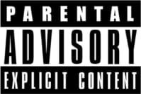
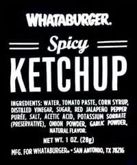
Using the Prohibition font designed by Stanton Street, O’Rourke’s logo placed in the middle of the rankings with 5.42 out of 10, and drew opinions as starkly opposed as its color scheme. One camp characterized the black-and-white as “harsh,” “ominous,” “militaristic,” and “dystopian,” with references to George Orwell’s 1984, Nazi Germany, Soviet Russia, and World War II. Another camp called it “strong,” “modern,” “bold,” and “impactful.” There were also several spot-on design comparisons, including a military logo, the parental advisory sticker — and, perhaps most endearingly, a spicy ketchup packet from fast-food restaurant Whataburger (beloved in O’Rourke’s home state of Texas).
Other comments:
“It really stands out. Almost like it punches you in the face.”
“The black makes it seem like it would be a logo for a rock band but not a political candidate.”
“Looks kind of evil.”
“I can’t help but feel this is something I would see in a store like Hot Topic.”
- Candidate: Tim Ryan
- Title: U.S. Rep. for Ohio since 2002
- Declared Candidacy: April 4, 2019

Survey respondents had a range of opinions about the classic color scheme of Tim Ryan’s logo — too unbalanced, derivative, off-putting; the blue is too light, the red too dark. A 24-year-old female independent voter from New Mexico said, “I love how smooth this logo is, and it also just screams America,” while a 64-year-old male Democrat from Texas responded with a virtual eye roll, “How novel. A name in red, white, and blue.” The majority sided with the latter, giving the logo and its Open Sans font an overall score of 4.37 out of 10 to land it in third-to-last place. Also, several commenters agreed that it looks like a news logo.

Other comments:
“It looks like a newscaster's name.”
“Can't tell if they are R or D, can't even tell it's for a political position.”
“Ugly makes it memorable — it's hard on the eyes.”
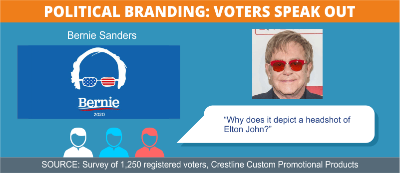
- Candidate: Bernie Sanders
- Title: U.S. Senator for Vermont since 2006
- Declared Candidacy: February 19, 2019
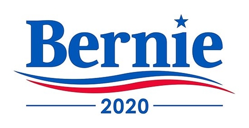
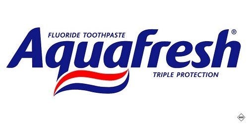
Sanders’ “swoosh” logo, which rated an overall score of 6.84 out of 10, ranks third behind only Biden and Sanders’ own “glasses” logo. The font used for both is Jubilat, styled by Revolution Messaging. Respondents gave descriptions from “crisp,” “clean,” and “sharp” to “average,” “generic,” and “traditional,” the consensus being that it has everything a classic campaign logo needs. The swoosh and the star were the most noted features, each with fans and detractors. And like a lot of things about the quirky politician, Sanders’ campaign logos have elicited lots of jokes — like a well-documented comparison to this classic toothpaste logo:
Other comments:
“It remains adequately pleasant.”
“Elegant and somehow conveys the sympathetic nature of his policies.”
“The best political logo I've seen in several years.”
“I see the name ‘Bernie’ and think of the movie ‘Weekend at Bernie's’.”
“Color, movement, simplicity. And stars. There should always be stars.”
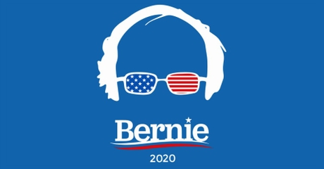
This irreverent logo, which plays on Sanders’ distinctly uncool silhouette, tops the list at an overall score of 7.16 out of 10. Many respondents cited its creative humor, visual novelty, and youthful appeal as reasons for ranking it highly, although some others rated it too “juvenile,” “immature” or “unprofessional” for someone aspiring to the highest office in the land. A 33-year-old male Libertarian from Pennsylvania summed it up by saying, “People who love him will love it. People who hate him will hate it. As a design element, it is clever and hits on his brand well.”
Other comments:
“What am I looking at?”
“Absolutely captures the spirit of Bernie. This is awesome!”
“It just looks weird. Sorry, Bernie.”
“Love the design. It is powerful, dynamic and memorable.”
“He's too old to have cool glasses.”
“Why does it depict a headshot of Elton John?”
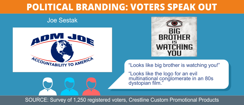
- Candidate: Joe Sestak
- Title: Former U.S. Navy admiral, 1974-2006, and U.S. Rep for Pennsylvania, 2006-2011
- Declared Candidacy: June 22, 2019
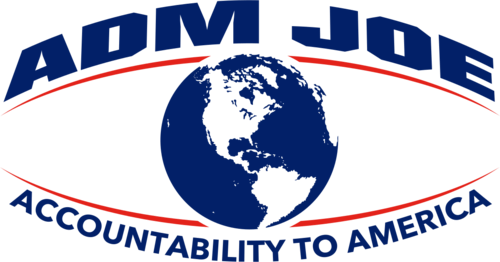
While some applauded its strong Overpass font and classic colors, Sestak’s logo also generated more than 90 comments and a lot of confusion. Not everyone was familiar with the abbreviation for “Admiral.” A 31-year-old Democratic woman from Pennsylvania asked, “Who on earth is this? Is Adm Joe an abbreviation? A name?” There were reservations about the image of the globe, the un-catchiness of the slogan, and — most pronounced — the unnerving impression of an eye. The logo ranked near the bottom with a 4.39 score out of 10.
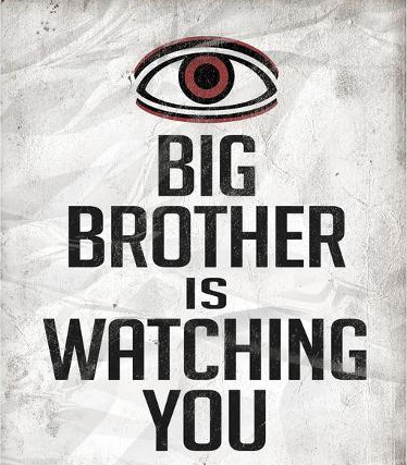
Other comments:
“Looks like big brother is watching you!”
“Looks like an old NASA T-shirt design.”
“Looks like the candidate is trying to take over the world.”
“Looks like a bad small business logo.”
“Looks like it was made 25 years ago on Microsoft paint.”
“Looks like the logo for an evil multinational conglomerate in an 80s dystopian film.”
“Looks like they want to clean my carpet.”
- Candidate: Tom Steyer
- Title: Billionaire hedge fund manager
- Declared Candidacy: July 9, 2019

The use of a first name only in Steyer’s logo was the biggest point of contention among survey respondents, especially for a candidate with extremely low name recognition. “I follow politics pretty closely, and I don't know who this is. I can't imagine a typical low-information voter would find this useful,” noted a 38-year-old male Democrat from Kentucky. Other issues included color, font, and balance. The logo ranked among the bottom with a score of 4.4 out of 10.
Other comments:
“I personally love this color blue.”
“This looks like a campaign sticker from the 60s. His ideas are probably outdated, too.”
“It's just an eyesore.”
“I don't know the last name and even though it is in big text, I don't think it would push me to go find out more information about the candidate.”
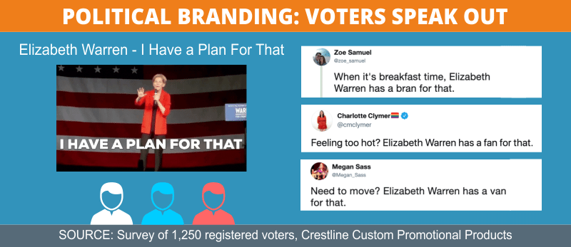
- Candidate: Elizabeth Warren
- Title: U.S. Senator for Massachusetts since 2012
- Declared Candidacy: February 9, 2019
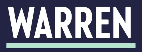
For both of Warren’s logos, designed by Bully Pulpit Interactive, the colors and Ringside font were the subject of much comment by survey respondents. The darker logo ranked in the lower half with an overall score of 4.75 out of 10. Many were confused by its single-word simplicity and unusual color choice, like the commenter who expressed the general consensus: “The green looks like the color of the Statue of Liberty, which is nice. That’s a different kind of patriotic color. But the design is a snoozefest. The font is really harsh,” commented a 47-year-old female independent voter from Florida. More than one compared it to an automobile logo.
Other comments:
“It feels like GM introduced a new car brand and called it the ‘Warren.’”
“This just looks threatening. She has a hard type of last name, I never noticed until seeing it huge and emblazoned in this way. WAR … scary.”
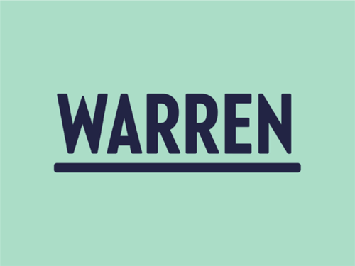
The light-green logo for Warren ranked ten spots lower than its counterpart, in dead-last place with a score of 3.89 over 10. The “Liberty green” color was one source of controversy, with its share of both allies and detractors. It was the font and oversimplified design, though, that seemed to elicit the most confusion and criticism, like “This logo is exceedingly dull and overly minimalistic,” said a 28-year-old Democratic man from Pennsylvania. “The green is not appealing when running to be the president of U.S.,” said a 31-year-old Republican woman from Texas.
Other comments:
“A little too minimalistic for someone as dynamic as Warren”
“No year? No 'merica propaganda? I do dig that it's one with a last name instead of first; it seems more serious than presumptuous.”
“What is this even about?”
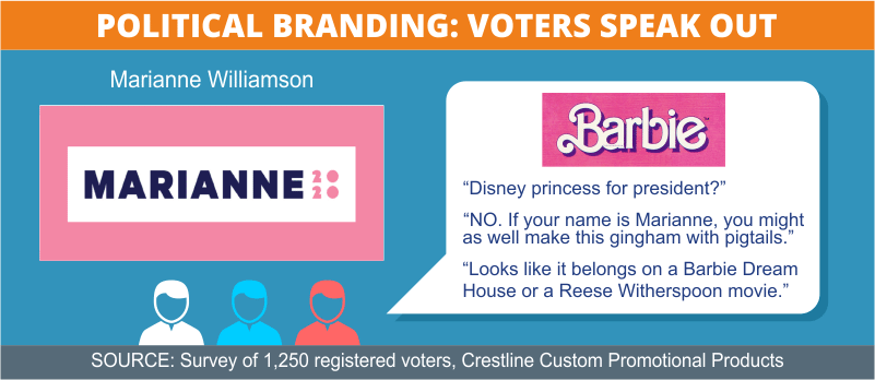
- Candidate: Marianne Williamson
- Title: Author and lecturer
- Declared Candidacy: January 28, 2019
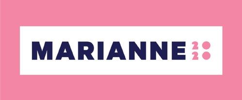
Williamson’s logo employs an uncommon color and a font (named FattiPatti) that generated a lot of opinions among survey takers — and ranked it second-to-last on the list with a score of 4.34 out of 10. While some commenters liked the pink, some compared it to Pepto-Bismol, Dunkin Donuts, and Disney princesses, while others decried the color’s implied connection with a female candidate. Many declared the color unpresidential. “It doesn't look like the logo of someone who is running to become President of the US, more like something for a brand of dolls. Barbie, maybe?” remarked a 58-year-old Democratic woman from New York.
Other comments:
“Disney princess for president?”
“Pink = NO = esp if your name is Marianne. Might as well make it gingham with pigtails.”
“Looks like it belongs on a Barbie Dream House or a Reese Witherspoon movie”
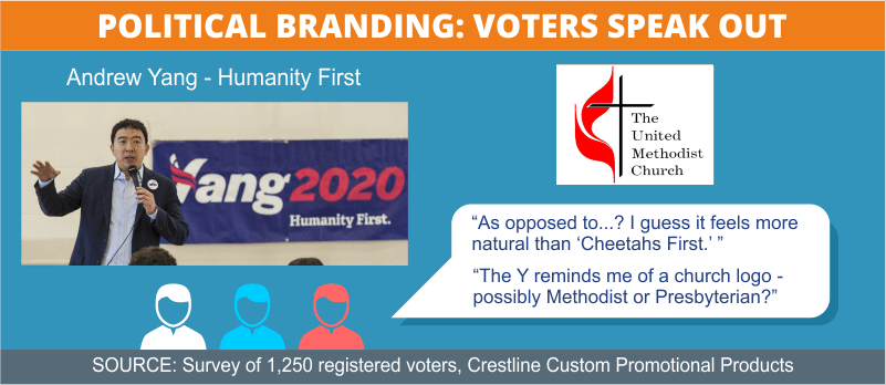
- Candidate: Andrew Yang
- Title: Billionaire businessman
- Declared Candidacy: November 6, 2017
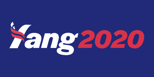
Although the majority of commenters expressed confusion about the spelling of Yang’s name because of the stylized Halyard Display font designed by Hannah Liz White, his logo still ranked among the Top 10 with an overall score of 5.81 out of 10. Descriptions included “eye-catching,” “appealing,” “stylish,” and “engaging.” More than one called attention to the fact that the stylized “swoosh” resembles a church logo.
Other comments:
“A one-name sign shouldn't be hard to read.”
“I like that they did at least something with the design to make it stand out.”
“Too loud and I can't even make out the name... it is Lang, Tang, Yang?”
- Republican Candidates
- Candidate: Donald Trump
- Title: 45th President of the United States
- Declared Candidacy: January 20, 2017

Trump’s solo logo, using the familiar Montserrat font, ranked 6th overall with a score of 6.01 out of 10. Responses ranged from “classic,” “strong” and “memorable” to “rigid,” “egocentric,” and “cliché.” Although respondents were asked to rate the logo, not the candidate, this was likely the most difficult instance for them to achieve that. Several echoed the 33-year-old Democratic man from New York who said, “Although I may not like the candidate, the design is memorable and it focuses on the most important aspects, the candidate and his slogan.” Many commenters enjoyed the border and the stars.
Other comments:
“Has the basic appearance of a license plate. It's an effective logo.”
“It looks like one of those plastic vanity license plates little kids put on their tricycles. Probably because of the box around it. The colors are patriotic, but it’s hard to take seriously.”
“This is one of the most impressive banners I have ever seen. It captures patriotism, brilliance, success, and love.”

Trump’s joint logo with Pence keeps essentially the same elements but ranked slightly lower in 10th place with an overall 5.73 score out of 10. The comments largely mirrored those for the other logo; Trump supporters loved it, many detractors grudgingly acknowledged its validity — and many applauded the border and the stars.
Other comments:
“Sorry, no way to separate evil regime from a PTSD-inducing logo.”
“Like the balance, almost like an upside-down pyramid.”
“Perfection! It screams simplicity, familiarity and America!”
- Candidate: Mark Sanford
- Title: Former Governor and U.S. Representative from South Carolina
- Declared Candidacy: September 8, 2019
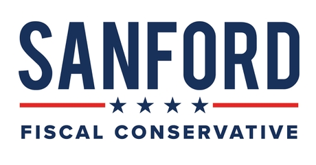
Sanford entered the race too late for his logo to be included in the survey. However, with the stars and lines, there are inescapable similarities to the logo of the man he hopes to unseat.
- Candidate: Joe Walsh
- Title: Former U.S. Representative from Illinois, 2011-2013
- Declared Candidacy: August 25, 2019
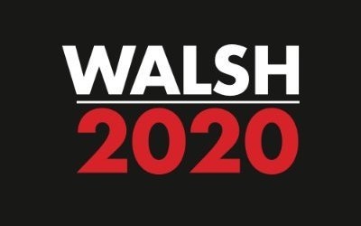
Walsh entered the race at the same time survey was launched. His slogan was included in the study, but his logo was not.
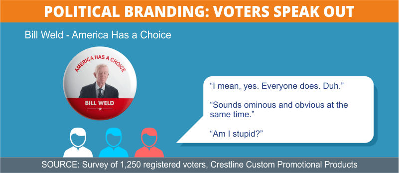
- Candidate: Bill Weld
- Title: Former Governor of Massachusetts, 1991-1997
- Declared Candidacy: April 15, 2019
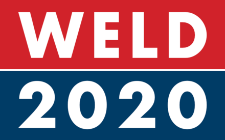
Weld’s logo landed at the halfway mark in the rankings with an overall score of 5.04 out of 10 and garnered comments of “bold,” “simple,” “standard,” “plain,” and “typical.” A 35-year-old Democratic man from New Mexico said, “The most cliché a political logo could be.” Another said it bears a strong resemblance to the Fox News logo.
Other comments:
“It looks like a food label.”
“It looks like a logo for beans.”
“This looks like a restaurant logo.”
“It's like we're going to the GAP.”
- Withdrawn Candidates
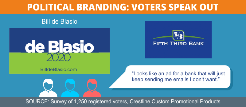
- Candidate: Bill de Blasio
- Title: Mayor of New York City since 2013
- Declared Candidacy: May 16, 2019
- Ended Campaign: September 20, 2019
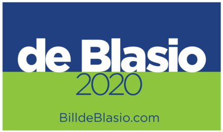
The varied Acier font and especially the uncommon color choice for de Blasio’s logo drew the majority of comments and placed it in the bottom third with an overall score of 4.74 out of 10. While some of those surveyed applauded the novelty of the green, most decried the shade and compared it to logos for health-care companies, small banks, or furniture stores.
Other comments:
“Why green?”
“I'm torn on this one. I sort of like it but I sort of hate it.”
“This looks like an ad for a bank that will just keep sending me emails I don't want.”
- Candidate: Kirsten Gillibrand
- Title: U.S. Senator for New York
- Declared Candidacy: March 17, 2019
- Ended Campaign: March 17, 2019
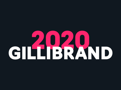
The overlapping of the Navigo Bold font and the bold color combination for Gillibrand’s logo caused a commotion, ranking it near the bottom with a 4.47 score out of 10. It garnered more than 80 responses, but a few summed up the consensus: “Doesn't seem presidential at all. The color scheme is an instant turn-off.” Others were “not a fan of the overlapping text.” Several thought it looked like a logo for a range of endeavors, including a podcast, horror movie, makeup company, workout gym for women only, a Comedy Central special, and the Powerpuff Girls.
Other comments:
“Feels like a Girl-Boss logo.”
“I'm a lady candidate, so it's pink!”
“Ultra low effort. ‘I need a logo.’ ‘Okay, put your name underneath 2020.’ ‘That's inspired.’ ”
“Weird flex, but NO!!!”
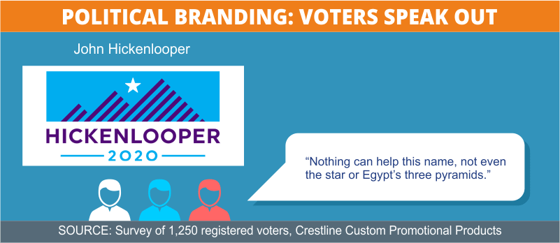
- Candidate: John Hickenlooper
- Title: former Governor of Colorado
- Declared Candidacy: March 4, 2019
- Ended Campaign: August 15, 2019
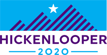
Hickenlooper’s logo, using Proxima Nova, takes greater chances with design than most, employing unusual colors to evoke both the U.S. flag’s stars and stripes and his home state of Colorado. This worked well for many respondents, earning the logo a 7th-place rank with a score of 5.83 out of 10. Many had reservations about using regional imagery for a national campaign (“... I don't know that the whole country cares about purple mountains' majesty…”), while several others noted a resemblance to the logos of adventure sportswear companies.
Other comments:
“Nothing can help this name, not even the star or Egypt’s three pyramids.”
“This is beautiful, love the motif and color. Very modern and confident.”
“There has to be a country with a flag like the background but it's not mine, probably good for an anarchist's platform.”
- Candidate: Jay Inslee
- Title: Governor of Washington since 2016
- Declared Candidacy: March 1, 2019
- Ended Campaign: August 21, 2019
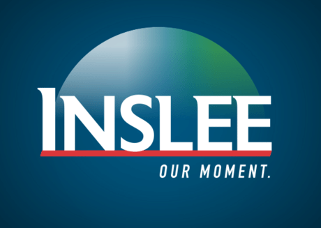
Inslee’s logo drew more fire than its serene design would suggest. The Montserrat font, half-globe, and muted colors placed it in the middle of the pack with a score of 4.88 out of 10. Several respondents commented that it resembles a business or TED talk logo. “Why does the earth look like a CD-ROM? It looks like the free software AOL sent out everywhere the 1990s,” noted a 46-year-old independent woman from Colorado.

Other comments:
“Gradients are sooo 2007.”
“Not very presidential/political. It looks like a product brand.”
“No patriotic colors used. Additionally, comes across too business-like.”
“Is that supposed to be the earth? Are they running for president of the earth?”
- Candidate: Seth Moulton
- Title: U.S. Rep. for Massachusetts since 2014
- Declared Candidacy: April 22, 2019
- Ended Campaign: August 23, 2019
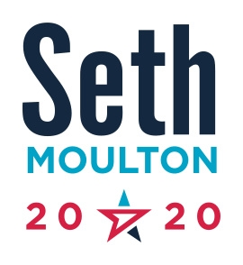
“I don't understand what's going on with the star. It looks like a mouse pointer or a paper airplane,” remarked a 40-year-old Democratic woman from Florida about Moulton’s logo, which fell in the middle of the rankings with its overall 5.43 score out of 10. The star was the sticking point for many survey-takers, whether they loved it or hated it. The League Gothic font and the varied colors also divided commenters; some applauded its clean design and approachability, and others had plenty of ideas for changing the shades.
Other comments:
“Love that star design -- makes you keep looking, not just glance at it.”
“I hate the red with that blue. I'm also confused what's going on with the star/arrow thing.”
“I don't even know what they were trying to achieve with the star. The top portion looks like the logo for a daytime talk show.”
“Dear Seth, if you have to explain the meaning of the star, you lost the race. And you lost me.”
- Candidate: Eric Swalwell
- Title: U.S. Rep. for California since 2012
- Declared Candidacy: April 8, 2019
- Ended Campaign: July 8, 2019
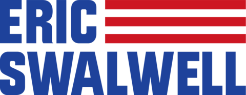
Using the font Industry Inc., Swalwell’s logo ranked just above the middle spot with an overall score of 5.31 out of 10. Not surprisingly, it also reminded many respondents of the American flag. While some enjoyed this fact (“This one is pretty cool how it turns into the flag”), others felt it was a “little too patriotic.”
Other comments:
“It's direct but probably too direct.”
“I'm not sure what I do or don't like about this. It feels like my dislike and like are fighting each other to make it neutral.”
“It's meh. It's too retro. It feels like Top Gun for some reason.”
“AMERICA. Let's just make our logo the flag! That will get them!”
Conclusion
From “It’s Morning Again in America” to “Yes, We Can” and beyond, branding is an important part of any political campaign. This is especially true in an election cycle like this one, which began with such a crowded and varied field of challengers. Candidates are taking all the measures they can to stand out from the crowd and establish themselves positively in the minds of voters — which has resulted in several trends and a new look for this year’s campaign trail.
A more diverse group of candidates is represented by more adventurous design approaches. In fashioning their logos, nearly half the hopefuls ventured outside the traditional patriotic U.S. political palette, although survey results show that many voters aren’t ready to give up the red-white-and-blue just yet.
Findings were similar for the names candidates chose to use on their logos. Although first-name-only logos are clearly on the rise — with the friendly, informal impressions they give — a slightly larger contingent of voters still seems to prefer the confidence and polish emitted by logos featuring surnames.
Overall, voters agree that — well, they want it all. A political logo and slogan should be clear, concise, and memorable, making the candidate seem confident and powerful, yet also friendly and accessible. Favorite logos are clever, even funny, but the candidates they represent should also be serious and down-to-earth. Modern and forward-thinking but also classic and traditional. Solid yet dynamic. Personable yet presidential. The good news is, with a campaign trail this crowded, the chances of getting what we want are better than ever.
At Crestline, we’ve been leaders in the promotional products industry for more than 50 years, providing world-class customer service and an exceptional line of products. We are experts in brand promotion and offer more than 100,000 different items that can be customized to help your brand project just the right image and stand out as unique and memorable.
Methodology
We commissioned an independent research firm to survey 1,258 U.S. residents who are registered voters. The survey was conducted online. Respondents were asked to evaluate 32 logos for 27 candidates. (Five prominent candidates had substantially different versions of their logos, so we had the respondents evaluate both images. Those candidates were Sanders, Biden, Trump, Harris, and Warren).
We also had respondents evaluate 28 slogans for 24 candidates. (Three candidates had more than one slogan. They were Sanders, Warren, and Trump.)
In every question and set of instructions, respondents were urged to focus on the design or slogan, not the candidate.
The respondents were 53% male, 47% female. They ranged in age from 18 to 73. They came from 48 states and the District of Columbia. (There were no responses from South Dakota or Wyoming.)
- Less than high school: .3%
- High school: 9.7%
- Some college: 26.8%
- Graduated college: 43.4%
- Some graduate school: 4.8%
- Completed graduate degree: 15%
- Registered Democrats: 45.9%
- Registered Republicans: 27.6%
- Independent, no affiliation: 23.1%
- Other party: 3.4%
- Conservative: 16%
- Lean conservative: 14%
- Moderate/Independent: 20.5%
- Lean liberal: 25.3%
- Liberal: 24.2%
- Voted for Donald Trump: 30%
- Voted for Hillary Clinton 45%
- Voted for third-party candidate: 9.4%
- Did not vote: 12.9%
- Rather not say: 2.7%
For promotion and branding ideas for political campaigns, check out:
4 Ways to Win Elections with Political Campaign Merchandise
5 Psychological Factors of Brand Awareness and Trust
Patriotic Giveaways and Gifts for 4th of July, Veterans Day and Year-Round
American Swag: The Best USA-Made Promotional Products
Fair Use
If you’re a blogger or journalist interested in covering this project, feel free to share or reproduce any of the images above. All we ask is that you please credit Crestline Custom Promotional Products and link to this page so your audience can find out more about the study and its methodology.